

Every week I am taking the time to discuss one of the art pieces that I, or me and my son, have created. I go through the thought process, the influences, the technique, etc. I am hoping that this post will help you better understand the origin of my art and admire all of its intricacies.
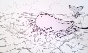
The piece that I am introducing you to today is called: “Moby Dick”. This piece is 11 x 17 inches in size, and was done with ink and soft pastels for the coloring. It is a framed picture giving it the total dimension of 15 inches by 21 inches.
This piece was a special order from the owner of the cafe located in Truro, N.S. called: “NovelTea Bookstore Cafe“. If you haven’t had the chance to visit the cafe, please make it a point to at lest stop by and have a nice cup of java. This cafe has ranked 10th in the top 31 cafes to visit in Canada.
“Moby Dick” was one of the pieces displayed on the cafe walls. I used the past tense here because it was sold not too long after it was displayed in the cafe.
When I first started this project, I already had the subject; Moby Dick. Jeremy, the owner of the cafe, asked me to create three pieces inspired by books. He wanted Moby Dick, Huck Fynn and Alice in wonderland. The representation of these was totally up to me.
At first I was intimidated by the project as I have never thought of getting inspired by stories told in books. So after hesitating, doubting myself and pushing the project away, I finally decided to get right into it and start with Moby Dick.
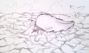
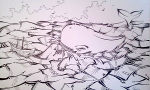
As I usually do, I began with a small cluster of lines and shapes. This usually gets me a point of origin in the drawing. (Fig.1) When I was done illustrating that little cluster, I thought to myself that I had to get the whale out of the way right away because the whale will define the look and story in the drawing. So I started to develop the back of the whale, giving it shape and movement. (Fig.2) Now that I had the back defined and the front, the hardest part was showing up; the creation of the belly side of the whale.
These lines will determine if I screw up this drawing or not. That was a lot of pressure to take in. You might say that I was hard on myself, I say that I have to, if not, the drawing would not have been as great as it is.
So I started creating a little sequence of lines. I couldn’t go with a straight line as the whale was in water and water is constantly moving. (Fig.3) These cluster of lines looked great to me as they kind of looked as if they where crashing into the whale.
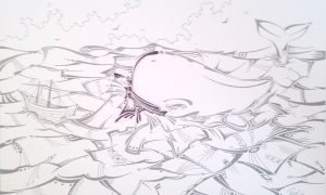
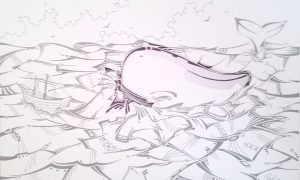
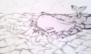
After the waves were done, I had to give life to the whale so i went on with defining it’s eye, it’s fin and tail. (Fig. 4 & 5) That would define the geographic location of the whale onto the ocean. When I looked at it, it looked like the whale was in motion, so I created a bit more details in the water surrounding the whale, to make it more obvious that the whale is crashing in the waves. (Fig. 6)
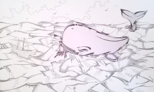
Now I was faced with a choice; how do I represent the ocean? Do I make it calm with little waves? Or should I create a stormy look in the ocean? I went with the latter. I decided to represent Moby Dick attacking one of those vessels in the water. That is what she was famous for, so why not show it.
So drawing next to those lines surrounding the whale, I started creating bigger waves. All of them crashing into one another. I started from the rear end of the whale (Fig.7), then defined the waves around the tail of the whale and a bit of the horizon as well (Fig.8 & 9), leaving me with a nice space in front of the whale to create a ship about to be clobbered by the whale.
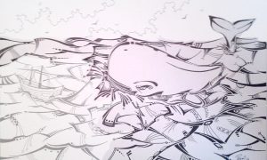
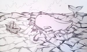
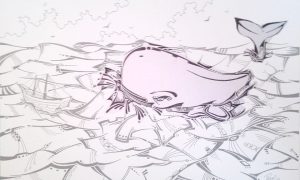
As I started creating the ship, I didn’t want t put sails on that ship as I wanted to represent the sailors as if they wanted to stand their ground and face the monster. Having the sails there would’ve represented, to me, a way of escaping this fight. (Fig.10) When I as done with the boat, I had to connect the boat to the whale with waves that would connect them visually and finish off the bottom left of the ocean. (Fig.11) As for the sky, I decided to represent two cluster of clouds trying to gain the space. I disposed them in an oblique to represent conflict, as two horizontal cluster of cloud would not have given the same effect. (Fig. 12)
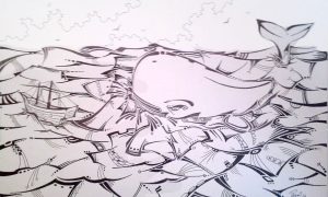
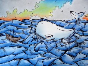
When came the time to color the piece, I went with a caribbean blue ocean, with shades of blue on the white whale itself. The coloring of the sky also represent the conflict between the color blue and orange. The are opposing colors on the color spectrum, so having them fight for the coloring of the sky emphasizes a lot more the conflict going on in the ocean.
When I brought this to Jeremy, he was so pleased he actually went and did cell phone cases, place mats and posters for sales in the cafe.
I truly enjoyed creating this piece and it is one of my favorites. I hope you enjoyed reading and learning about the creation process for this piece as much as I did.
In the meantime, keep creating!
0 comments on “This week in art – Moby Dick”