

Every week I am taking the time to discuss one of the art pieces that I, or me and my son, have created. I go through the thought process, the influences, the technique, etc. I am hoping that this post will help you better understand the origin of my art and admire all of its intricacies.
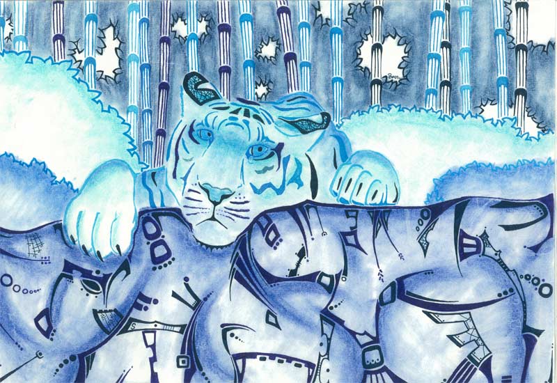
This week, I am talking about a piece that was created back in 2012. The piece is called :”Retired tiger” it is ink over paper, 13 inches x 19 inches in size and using only different shades of blue as I believe that the color blue represents peace and calmness.
This piece was special ordered by my mother who wanted to give a retirement gift to my father who worked a lot of years with Esso Imperial. Seeing that the official animal for Esso was the tiger, I decided to explore the possibility of seeing a tiger at rest. So I googled a couple of pictures to give me an idea as to how to represent the tiger.
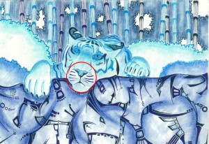
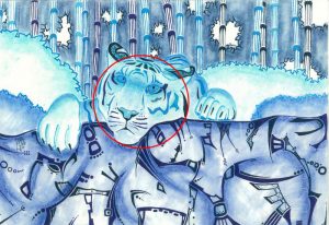
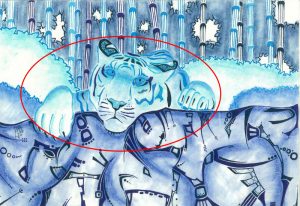
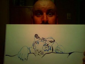
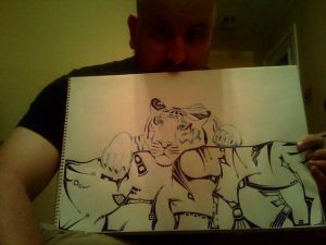
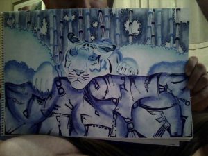
When I first started working on this piece, I immediately worked on the nose and mouth of the tiger as I wanted to get this just right.(Fig.1) I believed that if I got this right, the rest of the piece would all come in together. When I got the nose right, I went on to work on the proportions of the face and the paws that would be surrounding the tiger. (Fig. 2 & 3) At the end of the day, I had he basic proportions and detailing done on the tiger.(fig.4)
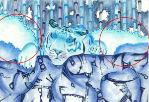
After a couple of days, I realized that my style wasn’t to present in the piece itself. Granted, I only had the tiger and the surface on which it rests done, but I wanted to add my touch, so I proceeded in creating the cliff side.(as seen in Fig.5 & 6.) I wanted to make sure that my personal touch was in the piece and I believe that my style really helped in the illusion of a cliff side.

Now after these things were completed, I was facing a problem as to what to put in the back. I did not want to recreate another rocky side as that would’ve been too much visually for the spectator. I spent a couple of days thinking about what to put as a background. So I first started by putting in bushes (Fig 7.) I was well pleased with those. Then I was faced with: “What do I do at the top?” At first I thought: “Lets create some clouds”, which was not a bad idea, at first, but when I came back to the drawing I saw that the bushes and the clouds would conflict together and that visually, the balance would not have been there. So I went back to the “Drawing Board”. After a couple more days, I realized that I illustrated a Bengal Tiger that can be found in India and that, in India, there are bamboo trees.
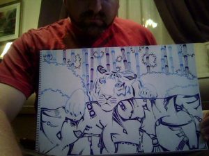
So I started working on the bamboo trees and I was really loving what was coming out of it. I chose three different colors for the trees as I wanted to have a 3d impression. Once I was done with the trees, I still had some white space to cover up, so I created brushes of leaves, as if we were deep in the jungle having this moment with this Bengal Tiger. (Fig. 8 & 9)
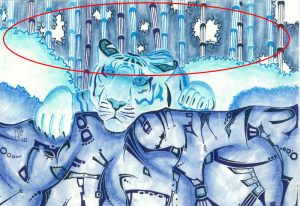
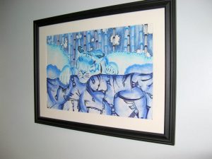
The coloring of the piece was really a no-brainer. I took four shades of pastel blue and started applying the soft pastels on to the piece. When I finally showed it to my parents (customers), they were really happy with the piece.(fig.10) It actually prompted them to order another piece. This “retired Tiger” can now be seen in my parents home.(Fig. 11)
I truly hope that this article brought a new light to the creation process of this piece and looking forward to next week where I will be presenting another piece. In the meantime, keep creating!
0 comments on “This week in Art – Retired”