

Every week I am taking the time to discuss one of the art pieces that I, or me and my son, have created. I go through the thought process, the influences, the technique, etc. I am hoping that this post will help you better understand the origin of my art and admire all of its intricacies.
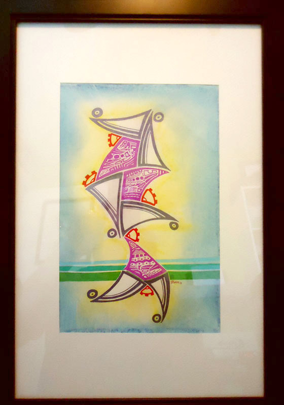
Today’s piece is an old piece that I created back in 2013. It’s dimensions are 7.5 inches by 11.5 inches. With the frame, it is 15 inches by 21 inches. This piece is for sale at 200$ and it is entitled “Riverside walk”.
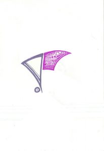
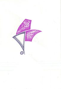
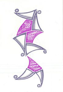
Sometimes when I create a lot of piece one after the other I feel like I have to rest my eyes visually and spiritually. This piece is a result of that! I still wanted to included the particularity of details but wanted to have geometrical structure and dynamic movement in the piece. So, as usual, I started in the top middle part of the piece with a particular, structured, form and added details in it. (as shown in Fig.1)
I also wanted to have colors that worked well together. Seeing that I chose fuchsia for the first color, which for me is really hard to develop with as I usually like earth tones, I decided to go with a faded purple for the second for that would complement the original one. The orientation for the second form was real important as it would determine the development of the piece. Since I wanted to follow up on the nice curve that I started with the first piece on the top, I placed the second element next to it on the left, continuing that curve. (Fig.2 & 3)
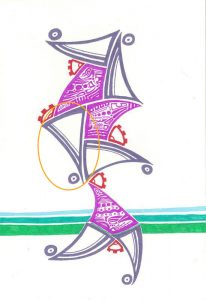
Now I had a choice, add another faded purple piece elsewhere or bring another fuchsia element. I looked at the piece, the curve that was developing very well. To help you visualize what I mean, I will simplify the image so that you can follow my eye as well. (fig.3a)
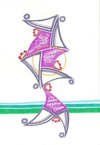
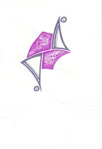
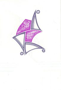
So I decided to follow the curve and draw over it with another fuchsia element. (as shown in fig.4) Now visually, this grouping felt unbalanced to me, so I added another faded purple piece on the right side of that new element.(fig. 5) Now since I had to element pointing downwards and upwards, I felt an unbalance there as well, I absolutely had to have elements that were pointing left and right to created that dynamic feeling I was looking for. So I added two pieces on top and under pointing left and right to have a full visual balance. (fig. 6 & 7)
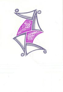
Now to me, this seemed balanced, but not for long as I saw that now, the element was being static. The pointers directed you in all directions, so I had to create a couple more elements to have that dynamic feel that I was looking for. I took a few steps back and realized that I could put elements at the bottom to simulate legs and movement, which I added, heading towards the right, as I felt the elements gravity pull would be proportionate to those legs. (Fig. 8)
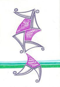
Once I was done with the legs, I was happy with the result as, visually, I felt rested. There wasn’t too much details in the art and the forms were bringing structure to the piece. One thins that I forgot to mention is the reason why I had those little circles on the edge of the dark purple element. I felt that without them, the piece was incomplete, like it was missing a visual hook. (fig.9) So I added them and it felt balanced. My mind was at ease but not for long. I still felt like something was missing. Sure this forms were dynamic and had movement, but I felt that I had to have a perspective element or a visual element for the spectator to rely on to see this movement happening. So it is without hesitation that I took three different colored pens, green, blue and light blue, to created some kind of riverside, horizontal plane.(fig.10)
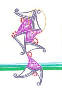
Now, after adding this horizontal element, I looked back at it and I still felt like there was, visually, a missing “wow” color. So I took my red pen and started to draw little gears, at least a quarter, to simulate that movement between the joints.(fig.11)
At the time I felt like the piece was complete. I framed it and had it framed for a couple of months. But then, at one point, I looked at it and felt like the white was overpowering the piece itself. So I had a decision to make, take it out of the frame and add color or just leave it. After a while, I decided to add the colored background. I chose to have the yellow surrounding the piece as motion and friction always causes sparks and energy and have the surrounding in blue since the walk takes place next to the water.
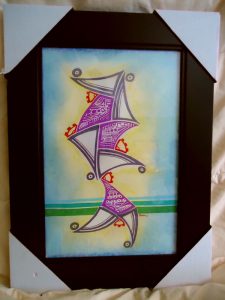
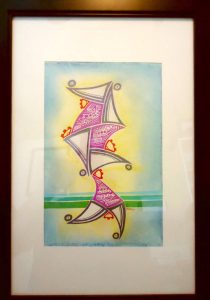
When I re-framed the piece, I had it in a frame that had no mat.(fig. 12) That did not last long as I felt that this frame was not doing justice to the piece. So I purchased a new frame, bigger in size, created a mat for the piece, since the piece is in an unconventional size, and I absolutely loved the result.(fig. 13)
I truly hope that you enjoyed learning about this piece. Until next time, keep on creating and have fun!
0 comments on “This week in Art – The walker”