
Every week I am taking the time to discuss one of the art pieces that I, or me and my son, have created. I go through the thought process, the influences, the technique, etc. I am hoping that this post will help you better understand the origin of my art and admire all of its intricacies.
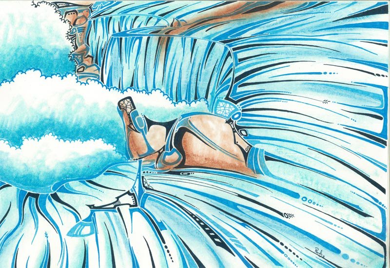
The piece that I am going to introduce to you today is entitled; “Tip of the falls” it is 11×17 in size and is now sold to a private party. The medium used on this piece is ink, soft pastels on canvas paper.
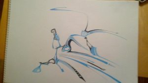
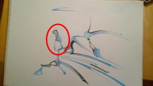
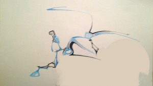
When I first started, I drew a couple of lines until I had what we call the artist block. Let me show you what I mean. In Fig. 1 you can see the start of the artwork, just a couple of minutes after that said “block”. At first, I drew the tipping rock, which at the time didn’t know that it was going to be a rock. (fig.2) After I drew these couple of shapes I decided to use a couple of lines to take a little bit more space on the canvas. (Fig.3) This is where the “block” started. I took a step back and contemplated what I have just drew, normally I would see something, but nothing was coming up yet, so I said to myself; “Alright! Just keep at it, you are bound to see something eventually”.
At the time, I just came out of doing two abstract pieces and was looking to make something a little bit more representative this time.
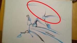
Seeing that the top was still a blank space, I decided to explore that area with a couple of curves to bring a bit more energy in the drawing. (Fig. 4) Still, I was left at a blank in my mind, not seeing anything popping up yelling; “I’M HERE!”
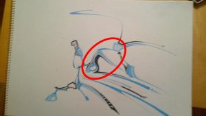
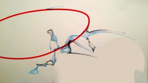
After staring at it for a while, and coming up with nothing because of the ambiguity of the layering of the shapes (Fig. 5), I decided to put it on the side and created a small piece called “Eeeeeeeeeagle!!” which is 5×7 inches in dimension using only ink as a medium. (Fig.6) That little break actually helped me to get away from the previous piece and then come back to it to see if I can visualize the subject of the drawing that was taking place. After looking at it for a while, I saw it the horseshoe was there the whole time and it turned out great that I was using different levels of blue to complete the piece as it was really appropriate. (Fig.7)
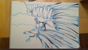
So I started drawing long lines that would simulate the motion of running waters. (as seen in Fig.1). And I kept on drawing those lines for a while, being careful not to make them too straight as water is organic , liquid not solid ice, unless I wanted to create a winter scene. That wasn’t the case here, I wanted to show the force of the water, the majesty of the falls, the vastness of the horseshoe; so I kept on drawing lines. (Fig. 8) When I believed I was done, I did not think that I had enough lines representing the water. (I know! Obsessive right?) So I drew more lines. I went all out in the creation of lines and curves, I really wanted the ink to give a really good representation of the Niagara Falls.(Fig. 9)
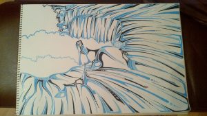
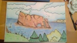
At first, the idea was to keep this piece as an ink on paper project. I thought that it looked great just like that. It was later on, when someone asked me to color in a piece that I had done for them to purchase (Fig. 11 & 12), that I decided to color in the Niagara Falls piece. (Fig. 10) I believe that the color really put an accent on the energy of the water running towards the fall. It really did it justice.


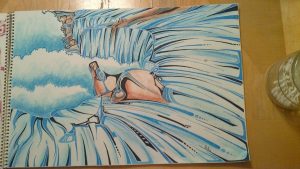
Once I sprayed the piece to make sure that the pastels would stay in place, The color really popped out. (Fig. 13 (* Please note that the picture was taken in a well light room with a better camera)) Just a couple of weeks after it was displayed on my Facebook page, I had a buyer for this piece. “Tip of the Falls”
I truly hope that you enjoyed reading on this piece as I had creating it. In the meantime, grab a pen and start creating!
0 comments on “This week in art – Niagara Falls”